Site Layout
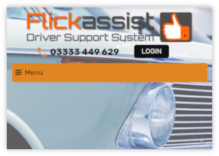
The Flickassist website will adjust it’s size and layout to fit the device you are using, whether it be a desktop, laptop, tablet or phone.
It will work on all operating systems whether they are Windows, IOS or Android, Because of this flexibility there is no need for an App.

When using a desktop or laptop computer there will be a classic menu bar across the top of the screen allows you access all the features. Just click the menu item you need. Contact details and further links can be found at the bottom of the screen.

If you are using a tablet or phone, the menu will condense to a hamburger style (3 horizontal lines) menu. Just click the hamburger icon to open the full menu.
